My Approach
Project Overview:
The goal of this project was to improve the user experience of the onboarding process for Rods & Cones products, making it more succinct and user-friendly. By streamlining the setup process, we aimed to help customers quickly engage with the product, fostering trust and loyalty from the outset.
When the project began in 2021, customers were frustrated by the complexity of the onboarding, resulting in low adoption and high abandonment rates. With six products in total—both hardware and software—the challenge was to create clear, accessible guides for five key products, particularly for users in operating rooms where time and technical barriers could hinder adoption.
The Rods & Cones product suite includes:
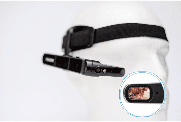
visOR-V: Vuzix smart glasses with R&C software.
visOR-I: An earlier edition of Vuzix smart glasses with R&C software.
mirrOR: A video converter paired with a Samsung Galaxy smartphone, using R&C software.
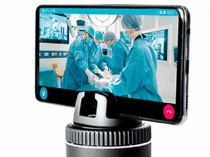
panOR & pod: A rotating camera setup with a Samsung Galaxy and a Pivo Pod, integrated with R&C software.
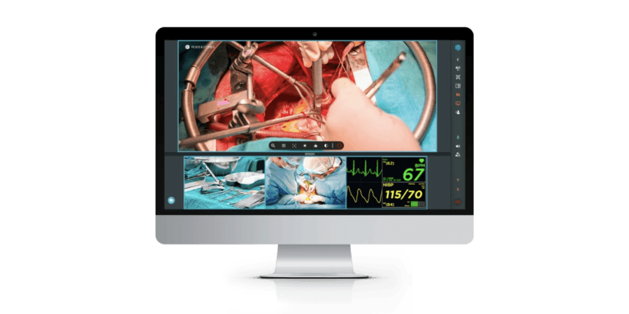
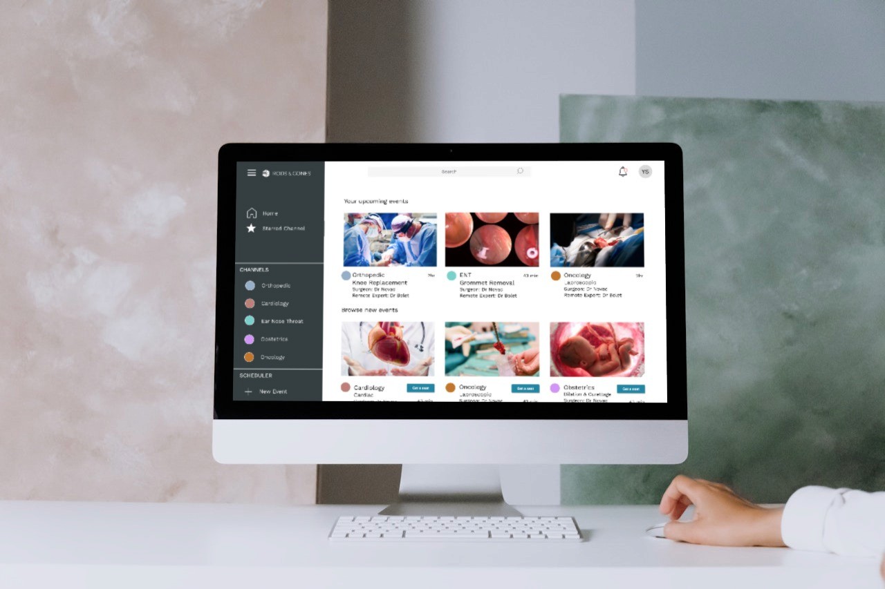
Remote Expert: Software allowing real-time, remote access to the OR.
Vision and Innovation
Problem Statement:
In an environment where global mobility is critical, there was an urgent need to provide seamless, remote access to knowledge sharing. Rods & Cones had the potential to solve this challenge by allowing medics and students to train and collaborate from anywhere in the world. However, the onboarding process was too complex, which discouraged adoption.
Hypothesis:
We hypothesised that simplifying the setup process would result in fewer customer service tickets, more positive user reviews, and higher ongoing usage of the products, especially the smart glasses appealing.
Identifying Unique Challenges
Defining the Problem:
The core challenge was to make the onboarding process simple and easy to understand across multiple languages. Users—whether they were medics in a busy OR or trainees with varying levels of technical ability—needed clear, step-by-step instructions to set up the products without frustration. The lack of consistent Wi-Fi access in operating rooms and the technical complexity of integrating hardware and software were additional hurdles we needed to address.
Research:
In the research phase, I analyzed various product start-up guides, both technical and non-technical, including those from Ikea, DJI, and Oculus. I tested existing Rods & Cones guides and mapped out the emotional journey of users. A deep dive into customer service data helped identify common pain points, while interviews with clients such as Johnson & Johnson and Medtronic shed light on specific setup issues their teams faced.
Resolving Complex Problems
Inspiration & Development:
I was inspired by product guides from companies like Ikea, known for simplicity, and technical guides from DJI and Oculus for more complex products. I focused on distilling complex steps into digestible instructions, while maintaining a high level of detail where necessary.
Style & Visual Direction:
Initially, I envisioned a "clean and sterile" design style, using 3D animation like the Oculus Quest 2 onboarding video. However, after investigating costs, we pivoted to using photography on a white infinity backdrop, which provided a similar aesthetic but at a much lower cost. This approach allowed us to achieve a futuristic, medical look while staying within budget.
User-Centric Design
Wireframing & Mid-Fi Designs:
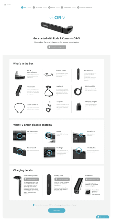
We created mid-fidelity wireframes for each of the five product guides, with clear steps, progress tracking, and checkpoints at the bottom of each page. These frames were tested with real users to ensure that they provided enough "hand-holding" through the setup process.
Final Design:
The final designs were developed to be compatible with WordPress, allowing users to access the guides both online and as downloadable PDFs. The site also included an easy-to-navigate "Get Started" section, making it simple for users to find the guide they needed.


Retrospective
Key Learnings:
Understanding the variations in our user personas was crucial. Surgeons, nurses, and medtech sales teams all had different levels of technical ability and different needs in terms of onboarding. Additionally, the lack of Wi-Fi in some operating rooms was a recurring issue that complicated the setup process for certain products.
Low Budget, High Impact:
Despite a limited budget, we achieved the "futuristic medical" style I envisioned, thanks to the use of photography and minimalist design. The end result was polished and professional, without exceeding cost constraints.
Placement & Accessibility:
We needed to ensure that the "Get Started" guides were easy to access on the marketing site. The guides were embedded directly into the WordPress platform, but post-launch user testing revealed that more hand-holding was required. Customers were still struggling with some of the setup steps, so we introduced video tutorials to complement the written guides.
Measure of Success
Success Metrics:
We measured success by monitoring:
The reduction in customer service tickets related to onboarding.
Positive feedback from users who found the setup process easy.
Continuous usage of the smart glasses and other products after initial setup.
By making the onboarding process smoother and more intuitive, we were able to enhance the user experience and increase product adoption.
Conclusion
The Rods & Cones Get Started Guides project was a significant step toward improving customer onboarding. By simplifying the setup process, we helped medics and other professionals quickly engage with the products, ultimately building trust and loyalty. Through thoughtful design, research, and user testing, we crafted a streamlined onboarding experience that caters to a diverse, global user base.
