My Approach
Project Goal:
The objective was to develop a tool that monitors progress toward net zero goals, catering to clients, employees, and stakeholders. The project highlighted the individuals accountable for tracking progress and outlined the tactics to achieve these goals. More than just delivering data, our mission was to increase reliability and user engagement while driving awareness and generating leads.
Success Metrics:
Success was measured through AXA’s digital analytics, including tracking traffic to the monitor via organic and paid channels, email marketing, internal communications, PPC campaigns, interactivity with the tool, and engagement metrics like email open rates and social post interactions.
Vision and Innovation
Research & Common Patterns:
I utilised a blend of qualitative and quantitative research methods to identify key target consumers and their demographics. Additionally, I analysed market competitors like Aviva and Blackrock, investigating their ESG strategies and examining how other ESG-forward companies such as Oatly communicated their net zero efforts.
We discovered several patterns, including the importance of credibility, robust ESG content, and user-friendly websites. However, challenges surfaced around information overload, jargon, and subpar mobile experiences. By conducting a competitive evaluation and SWOT analysis, we were able to assess threats such as accusations of greenwashing and evolving ESG regulations. The absence of standardised ESG information also posed difficulties for users trying to compare progress across platforms.
Identifying Unique Challenges
Initial Design Challenges:
The first iteration showcased KPIs as a simple list. Each KPI had a heading and subheading for context, while a bar indicated goals but failed to show progress. Users had to hover for more information, but tooltips proved problematic due to limited space and accessibility issues—especially on mobile devices. The design also lacked space for multimedia integration.
Footnote Concerns:
Another issue was the use of footnotes. From a UX perspective, footnotes disrupt the reading flow and increase cognitive load. Additionally, they are often overlooked on mobile devices. We recommended avoiding footnotes in favour of better alternatives, such as expandable sections or modal dialogs.
Resolving Complex Problems
Selecting the Data Visualisation:
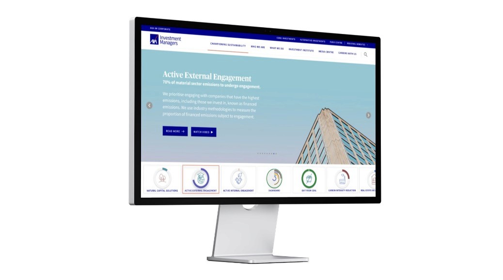
The tool needed a way to display KPI progress effectively. Since we were measuring progress from one point to another, we avoided traditional line graphs and bar charts. Instead, we opted for progress donuts, which allow for visual comparison, transparency, and data comprehension at a glance. The donuts engage users with interactive elements, providing an emotional connection and reinforcing the concept of progress.
Design Solution - Hero Slider:
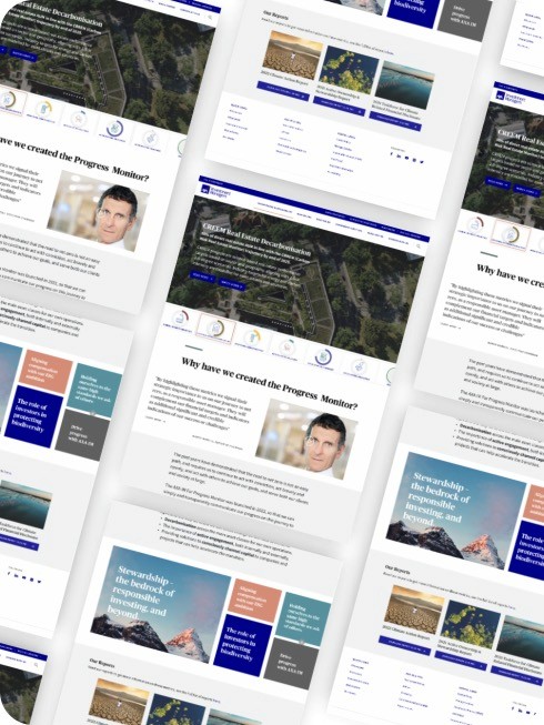
Inspired by streaming platforms, we implemented a hero slider at the top of the page, where users could select KPI progress donuts. This interactive slider highlighted each KPI with relevant multimedia, text, and CTAs, offering users an immersive experience. The concept mimicked how streaming services showcase featured content, making it visually striking and easy to navigate.
Multimedia Management:
Once multimedia was selected, it enlarged in the same frame, providing a seamless viewing experience. Additional media could be accessed via a list in the top right corner of the frame, while a simple “X” in the top left allowed users to close the media easily.
Infographic Tiles:
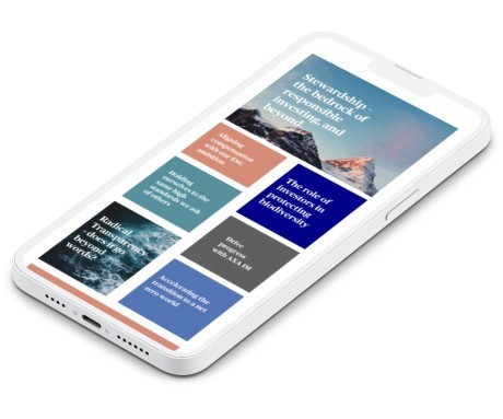
Further down the page, I introduced infographic tiles with overlaying text and visuals. These tiles present complex information quickly and clearly, improving user cognition and engagement by showcasing patterns and trends through visuals.
User-Centric Design
KPI Animation & CTA Streamlining:
We animated the progress donuts to load upon page entry or user selection, adding a dynamic touch to the KPIs. Initially, the client included several CTAs for each metric, but we streamlined these to prevent user paralysis. A clean, concise set of options helped improve user focus and actionability.
Multimedia Interaction:
The design ensured that users could access videos, podcasts, and audio clips without leaving the page. Workshops with stakeholders helped us finalise a design that met all requirements, ensuring the multimedia experience remained intuitive and consistent.
Accessibility and Optimisation
Mobile Optimisation & Storytelling:
One of the major improvements involved optimising the site for mobile devices and reducing cognitive load. Storytelling techniques, along with clear, concise content, allowed users to engage with ESG data in a more relatable and digestible manner.
Retrospective
Iterative Design Process:
It took three iterations to find the perfect balance between multimedia integration and user retention on the same page. The solution now features a unified display for KPIs, multimedia, text, and CTAs—all working together seamlessly. We also focused heavily on visual clarity and accuracy, ensuring that users could instantly understand KPI progress.
Stakeholder Collaboration:
A key aspect of the project was frequent workshops with stakeholders, ensuring every iteration addressed likes, dislikes, and functionality requirements. By blending stakeholder input into a cohesive "Frankenstein design," we achieved a solution that satisfied all parties.
Conclusion
The AXA IM Progress Monitor successfully tracks progress toward net zero objectives with an intuitive, visually compelling interface. Through clear data visualisation, interactive multimedia, and a streamlined user journey, we created an experience that boosts awareness, engagement, and transparency in AXA IM’s ESG efforts.
